Kotlin용 Lets-Plot을 활용한 데이터 시각화
Kotlin용 Lets-Plot (LPK)은 R의 ggplot2 라이브러리를 Kotlin으로 이식한 멀티플랫폼 플로팅(plotting) 라이브러리입니다. LPK는 기능이 풍부한 ggplot2 API를 Kotlin 생태계로 가져와, 정교한 데이터 시각화 기능이 필요한 과학자와 통계학자에게 적합한 도구를 제공합니다.
LPK는 Kotlin 노트북, Kotlin/JS, JVM의 Swing, JavaFX, Compose Multiplatform 등 다양한 플랫폼을 지원합니다. 또한, LPK는 IntelliJ, DataGrip, DataSpell, PyCharm과 원활하게 통합됩니다.
이 튜토리얼에서는 IntelliJ IDEA의 Kotlin Notebook에서 LPK와 Kotlin DataFrame 라이브러리를 사용하여 다양한 유형의 플롯을 생성하는 방법을 보여줍니다.
시작하기 전에
Kotlin Notebook은 IntelliJ IDEA에 기본적으로 포함되어 활성화되어 있는 Kotlin Notebook 플러그인에 의존합니다.
Kotlin Notebook 기능을 사용할 수 없는 경우, 플러그인이 활성화되어 있는지 확인하세요. 자세한 내용은 환경 설정을 참조하세요.
Lets-Plot을 사용하기 위해 새 Kotlin Notebook을 생성합니다.
File | New | Kotlin Notebook을 선택합니다.
노트북에서 다음 명령을 실행하여 LPK와 Kotlin DataFrame 라이브러리를 가져옵니다(import).
kotlin%use lets-plot %use dataframe
데이터 준비하기
베를린, 마드리드, 카라카스 세 도시의 월평균 기온 시뮬레이션 데이터를 저장하는 데이터프레임(DataFrame)을 만들어 보겠습니다.
Kotlin DataFrame 라이브러리의 dataFrameOf() 함수를 사용하여 데이터프레임을 생성합니다. 다음 코드 스니펫을 Kotlin Notebook에 붙여넣고 실행하세요.
// months 변수는 1년 12개월의 리스트를 저장합니다.
val months = listOf(
"January", "February",
"March", "April", "May",
"June", "July", "August",
"September", "October", "November",
"December"
)
// tempBerlin, tempMadrid, tempCaracas 변수는 각 월별 기온 값을 리스트로 저장합니다.
val tempBerlin =
listOf(-0.5, 0.0, 4.8, 9.0, 14.3, 17.5, 19.2, 18.9, 14.5, 9.7, 4.7, 1.0)
val tempMadrid =
listOf(6.3, 7.9, 11.2, 12.9, 16.7, 21.1, 24.7, 24.2, 20.3, 15.4, 9.9, 6.6)
val tempCaracas =
listOf(27.5, 28.9, 29.6, 30.9, 31.7, 35.1, 33.8, 32.2, 31.3, 29.4, 28.9, 27.6)
// df 변수는 월별 기록, 기온, 도시를 포함한 세 개의 열을 가진 DataFrame을 저장합니다.
val df = dataFrameOf(
"Month" to months + months + months,
"Temperature" to tempBerlin + tempMadrid + tempCaracas,
"City" to List(12) { "Berlin" } + List(12) { "Madrid" } + List(12) { "Caracas" }
)
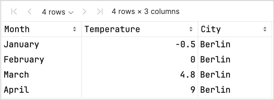
df.head(4)데이터프레임에 Month, Temperature, City라는 세 개의 열이 있는 것을 확인할 수 있습니다. 데이터프레임의 처음 네 행에는 1월부터 4월까지 베를린의 기온 기록이 포함되어 있습니다.
LPK 라이브러리를 사용하여 플롯을 생성하려면 데이터(df)를 키-값 쌍으로 데이터를 저장하는 Map 유형으로 변환해야 합니다. .toMap() 함수를 사용하여 데이터프레임을 Map으로 쉽게 변환할 수 있습니다.
val data = df.toMap()산점도 생성하기
Kotlin Notebook에서 LPK 라이브러리로 산점도(Scatter plot)를 만들어 보겠습니다.
데이터가 Map 형식으로 준비되면 LPK 라이브러리의 geomPoint() 함수를 사용하여 산점도를 생성합니다. X축과 Y축의 값을 지정하고, 카테고리와 해당 색상을 정의할 수 있습니다. 또한, 필요에 따라 플롯의 크기와 점의 모양을 사용자 정의(customize)할 수 있습니다.
// X축과 Y축, 카테고리와 색상, 플롯 크기 및 플롯 유형을 지정합니다.
val scatterPlot =
    letsPlot(data) { x = "Month"; y = "Temperature"; color = "City" } + ggsize(600, 500) + geomPoint(shape = 15)
scatterPlot
결과는 다음과 같습니다.

박스 플롯 생성하기
데이터를 박스 플롯(Box plot)으로 시각화해 보겠습니다. LPK 라이브러리의 geomBoxplot() 함수를 사용하여 플롯을 생성하고, scaleFillManual() 함수로 색상을 사용자 정의합니다.
// X축과 Y축, 카테고리, 플롯 크기 및 플롯 유형을 지정합니다.
val boxPlot = ggplot(data) { x = "City"; y = "Temperature" } + ggsize(700, 500) + geomBoxplot { fill = "City" } +
    // 색상을 사용자 정의합니다.
    scaleFillManual(values = listOf("light_yellow", "light_magenta", "light_green"))
boxPlot
결과는 다음과 같습니다.

2D 밀도 플롯 생성하기
이제 임의 데이터의 분포와 집중도를 시각화하기 위해 2D 밀도 플롯(2D density plot)을 만들어 보겠습니다.
2D 밀도 플롯을 위한 데이터 준비
데이터를 처리하고 플롯을 생성하기 위한 의존성을 가져옵니다.
kotlin%use lets-plot @file:DependsOn("org.apache.commons:commons-math3:3.6.1") import org.apache.commons.math3.distribution.MultivariateNormalDistributionKotlin Notebook으로 의존성을 가져오는 방법에 대한 자세한 내용은 Kotlin Notebook 문서를 참조하세요.
다음 코드 스니펫을 Kotlin Notebook에 붙여넣고 실행하여 2D 데이터 포인트 세트를 생성합니다.
kotlin// 세 가지 분포에 대한 공분산 행렬을 정의합니다. val cov0: Array<DoubleArray> = arrayOf( doubleArrayOf(1.0, -.8), doubleArrayOf(-.8, 1.0) ) val cov1: Array<DoubleArray> = arrayOf( doubleArrayOf(1.0, .8), doubleArrayOf(.8, 1.0) ) val cov2: Array<DoubleArray> = arrayOf( doubleArrayOf(10.0, .1), doubleArrayOf(.1, .1) ) // 샘플 수를 정의합니다. val n = 400 // 세 가지 분포에 대한 평균을 정의합니다. val means0: DoubleArray = doubleArrayOf(-2.0, 0.0) val means1: DoubleArray = doubleArrayOf(2.0, 0.0) val means2: DoubleArray = doubleArrayOf(0.0, 1.0) // 세 개의 다변량 정규 분포에서 임의 샘플을 생성합니다. val xy0 = MultivariateNormalDistribution(means0, cov0).sample(n) val xy1 = MultivariateNormalDistribution(means1, cov1).sample(n) val xy2 = MultivariateNormalDistribution(means2, cov2).sample(n)위 코드에서
xy0,xy1,xy2변수는 2D(x, y) 데이터 포인트가 포함된 배열을 저장합니다.데이터를
Map유형으로 변환합니다.kotlinval data = mapOf( "x" to (xy0.map { it[0] } + xy1.map { it[0] } + xy2.map { it[0] }).toList(), "y" to (xy0.map { it[1] } + xy1.map { it[1] } + xy2.map { it[1] }).toList() )
2D 밀도 플롯 생성
이전 단계의 Map을 사용하여 2D 밀도 플롯(geomDensity2D)을 생성합니다. 배경에 산점도(geomPoint)를 함께 그려 데이터 포인트와 이상치(outliers)를 더 잘 시각화할 수 있습니다. scaleColorGradient() 함수를 사용하여 색상 스케일을 사용자 정의할 수 있습니다.
val densityPlot = letsPlot(data) { x = "x"; y = "y" } + ggsize(600, 300) + geomPoint(
    color = "black",
    alpha = .1
) + geomDensity2D { color = "..level.." } +
        scaleColorGradient(low = "dark_green", high = "yellow", guide = guideColorbar(barHeight = 10, barWidth = 300)) +
        theme().legendPositionBottom()
densityPlot
결과는 다음과 같습니다.

다음 단계
- Lets-Plot for Kotlin 문서에서 더 많은 플롯 예제를 살펴보세요.
- Lets-Plot for Kotlin의 API 레퍼런스를 확인하세요.
- Kotlin DataFrame 및 Kandy 라이브러리 문서에서 Kotlin을 사용한 데이터 변환 및 시각화에 대해 알아보세요.
- Kotlin Notebook의 사용법 및 주요 기능에 대한 추가 정보를 찾아보세요.