Kandy를 사용한 데이터 시각화
Kotlin은 강력하고 유연한 데이터 시각화를 위한 올인원 솔루션을 제공하여, 복잡한 모델을 다루기 전에 데이터를 직관적으로 제시하고 탐색할 수 있는 방법을 제공합니다.
이 튜토리얼에서는 Kotlin Notebook과 Kandy 및 Kotlin DataFrame 라이브러리를 사용하여 IntelliJ IDEA에서 다양한 차트 유형을 만드는 방법을 보여줍니다.
시작하기 전에
Kotlin Notebook은 IntelliJ IDEA에 기본적으로 포함되어 활성화되어 있는 Kotlin Notebook 플러그인에 의존합니다.
Kotlin Notebook 기능을 사용할 수 없는 경우, 플러그인이 활성화되어 있는지 확인하세요. 자세한 내용은 환경 설정을 참조하세요.
이 튜토리얼을 따라 하려면:
새로운 Kotlin Notebook을 생성합니다.
노트북에서 Kandy 및 Kotlin DataFrame을 가져옵니다:
kotlin%use kandy %use dataframe
노트북에서 DataFrame 라이브러리와 해당 API를 사용할 수 있도록 다른 코드 셀보다 먼저
%use dataframe줄이 포함된 코드 셀을 실행하세요.
DataFrame 생성
시작하기 위해 시각화할 데이터를 포함하는 DataFrame(데이터프레임)을 생성해 보겠습니다. 이 DataFrame은 베를린, 마드리드, 카라카스 세 도시의 월별 평균 기온 시뮬레이션 수치를 저장합니다.
// months 변수는 1년 12개월의 리스트를 저장합니다.
val months = listOf(
    "January", "February",
    "March", "April", "May",
    "June", "July", "August",
    "September", "October", "November",
    "December"
)
// tempBerlin, tempMadrid, tempCaracas 변수는 각 도시의
// 월별 기온 값을 리스트로 저장합니다.
val tempBerlin =
    listOf(-0.5, 0.0, 4.8, 9.0, 14.3, 17.5, 19.2, 18.9, 14.5, 9.7, 4.7, 1.0)
val tempMadrid =
    listOf(6.3, 7.9, 11.2, 12.9, 16.7, 21.1, 24.7, 24.2, 20.3, 15.4, 9.9, 6.6)
val tempCaracas =
    listOf(27.5, 28.9, 29.6, 30.9, 31.7, 35.1, 33.8, 32.2, 31.3, 29.4, 28.9, 27.6)
이제 새로운 변수(df)를 만들고 dataFrameOf() 함수를 사용하여 세 개의 열(Month, Temperature, City)로 구성된 DataFrame을 생성합니다:
val df = dataFrameOf(
    "Month" to months + months + months,
    "Temperature" to tempBerlin + tempMadrid + tempCaracas,
    "City" to List(12) { "Berlin" } + List(12) { "Madrid" } + List(12) { "Caracas" }
)
데이터를 미리 보려면 .head() 함수를 사용하세요:
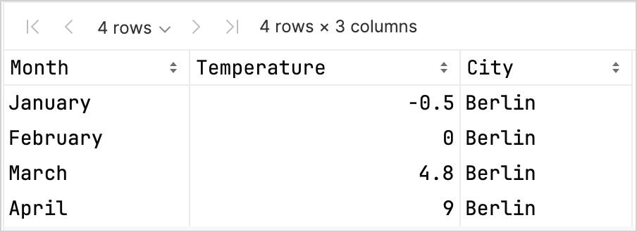
df.head(4) // 처음 4개 행을 반환합니다.이 데이터셋의 처음 4개 행에는 1월부터 4월까지 베를린의 기온 레코드가 포함되어 있습니다:
Kandy와 Kotlin DataFrame 라이브러리를 함께 사용할 때 타입 안전성(type safety)을 높이는 데 도움이 되는 컬럼 레코드 접근 옵션들이 다양하게 있습니다. 자세한 내용은 Access APIs를 참조하세요.
선형 차트 생성
이전 섹션에서 만든 df DataFrame을 사용하여 Kotlin Notebook에서 선형 차트(line chart)를 만들어 보겠습니다:
- Kandy 라이브러리의
.plot()함수를 호출합니다. line()레이어를 적용합니다.Month와Temperature컬럼을 각각X및Y축에 매핑합니다.- (선택 사항) 색상과 크기를 맞춤 설정합니다.
df.plot {
   line {
      x(Month)
      y(Temperature)

      color(City) {
         scale = categorical(
            "Berlin" to Color.hex("#6F4E37"),
            "Madrid" to Color.hex("#C2D4AB"),
            "Caracas" to Color.hex("#B5651D")
         )
      }
      width = 1.5
   }
   layout {
      size = 1000 to 450
   }
}
결과는 다음과 같습니다:

포인트 차트 생성
이제 df DataFrame을 포인트(산점도, scatter) 차트로 시각화해 보겠습니다:
- Kandy 라이브러리의
.plot()함수를 호출합니다. points()레이어를 적용합니다.Month와Temperature컬럼을 각각X및Y축에 매핑합니다.- (선택 사항) 색상, 축 레이블, 포인트 크기 및 차트 제목을 맞춤 설정합니다.
df.plot {
   points {
      x(Month) {
         axis.name = "Month"
      }
      y(Temperature) {
         axis.name = "Temperature"
      }

      color(City) {
         scale = categorical(
            "Berlin" to Color.hex("#6F4E37"),
            "Madrid" to Color.hex("#C2D4AB"),
            "Caracas" to Color.hex("#B5651D")
         )
      }
      size = 5.5
   }
   layout {
      title = "Temperature per month"
   }
}
결과는 다음과 같습니다:

막대 차트 생성
마지막으로 각 도시별 막대 차트(bar chart)를 만들어 보겠습니다:
.groupBy()함수를 사용하여 DataFrame을City컬럼으로 그룹화합니다.- Kandy 라이브러리의
plot()함수를 호출합니다. bars()레이어를 적용합니다.- (선택 사항) 차트 제목을 추가하고 색상을 맞춤 설정합니다.
df.groupBy { City }.plot {
    bars {
        x(Month)
        y(Temperature)

        fillColor(City) {
            scale = categorical(
                "Berlin" to Color.hex("#6F4E37"),
                "Madrid" to Color.hex("#C2D4AB"),
                "Caracas" to Color.hex("#B5651D")
            )
        }
    }
    layout.title {
       title = "Temperature per month"
    }
}
결과는 다음과 같습니다:

다음 단계
- Kandy 라이브러리 문서에서 더 많은 차트 예제를 살펴보세요.
- Lets-Plot 라이브러리 문서에서 더 고급 플로팅(plotting) 옵션을 살펴보세요.
- Kotlin DataFrame 라이브러리 문서에서 데이터프레임 생성, 탐색 및 관리에 대한 추가 정보를 찾아보세요.
- 이 YouTube 비디오에서 Kotlin Notebook의 데이터 시각화에 대해 자세히 알아보세요.