Kotlin 為強大且靈活的資料視覺化提供了一站式解決方案,在深入研究複雜模型之前,提供了一種直觀的方式來呈現和探索資料。
本教學示範如何使用 IntelliJ IDEA 中的 Kotlin Notebook 配合 Kandy 和 Kotlin DataFrame 程式庫來建立不同的圖表類型。
開始之前
Kotlin Notebook 依賴於 Kotlin Notebook 外掛程式,該外掛程式預設在 IntelliJ IDEA 中內建並啟用。
如果 Kotlin Notebook 功能無法使用,請確保已啟用該外掛程式。若要了解更多資訊,請參閱設定環境。
若要按照本教學進行操作:
建立一個新的 Kotlin Notebook。
在您的 notebook 中,匯入 Kandy 和 Kotlin DataFrame:
kotlin%use kandy %use dataframe
在執行任何其他程式碼資料格之前,請先執行包含
%use dataframe行的程式碼資料格,以確保 DataFrame 程式庫及其 API 在 notebook 中可用。
建立 DataFrame
首先,讓我們建立一個包含要視覺化資料的 DataFrame。此 DataFrame 儲存了柏林、馬德里和卡拉卡斯三個城市模擬的每月平均氣溫:
// months 變數儲存包含一年 12 個月的列表
val months = listOf(
    "January", "February",
    "March", "April", "May",
    "June", "July", "August",
    "September", "October", "November",
    "December"
)
// tempBerlin、tempMadrid 和 tempCaracas 變數分別儲存
// 每個城市的每月氣溫值列表
val tempBerlin =
    listOf(-0.5, 0.0, 4.8, 9.0, 14.3, 17.5, 19.2, 18.9, 14.5, 9.7, 4.7, 1.0)
val tempMadrid =
    listOf(6.3, 7.9, 11.2, 12.9, 16.7, 21.1, 24.7, 24.2, 20.3, 15.4, 9.9, 6.6)
val tempCaracas =
    listOf(27.5, 28.9, 29.6, 30.9, 31.7, 35.1, 33.8, 32.2, 31.3, 29.4, 28.9, 27.6)
現在讓我們建立一個新變數 (df),並使用 dataFrameOf() 函式來產生一個包含三欄(Month、Temperature 和 City)的 DataFrame:
val df = dataFrameOf(
    "Month" to months + months + months,
    "Temperature" to tempBerlin + tempMadrid + tempCaracas,
    "City" to List(12) { "Berlin" } + List(12) { "Madrid" } + List(12) { "Caracas" }
)
若要預覽資料,請使用 .head() 函式:
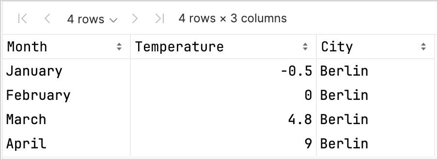
df.head(4) // 傳回前四列在我們的資料集中,前四列儲存了柏林從一月到四月的氣溫:
存取欄位記錄有不同的選項,這可以幫助您在同時使用 Kandy 和 Kotlin DataFrame 程式庫時提高型別安全性。 若要了解更多資訊,請參閱存取 API。
建立折線圖
讓我們使用上一節中的 df DataFrame 在 Kotlin Notebook 中建立折線圖:
- 呼叫 Kandy 程式庫中的
.plot()函式。 - 套用
line()圖層。 - 將
Month和Temperature欄位分別對應到X軸和Y軸。 - (選填)自訂顏色和大小。
df.plot {
   line {
      x(Month)
      y(Temperature)

      color(City) {
         scale = categorical(
            "Berlin" to Color.hex("#6F4E37"),
            "Madrid" to Color.hex("#C2D4AB"),
            "Caracas" to Color.hex("#B5651D")
         )
      }
      width = 1.5
   }
   layout {
      size = 1000 to 450
   }
}
這是結果:

建立點狀圖
現在,讓我們在點狀(散佈)圖中視覺化 df DataFrame:
- 呼叫 Kandy 程式庫中的
.plot()函式。 - 套用
points()圖層。 - 將
Month和Temperature欄位分別對應到X軸和Y軸。 - (選填)自訂顏色、軸標籤、點大小和圖表標題。
df.plot {
   points {
      x(Month) {
         axis.name = "Month"
      }
      y(Temperature) {
         axis.name = "Temperature"
      }

      color(City) {
         scale = categorical(
            "Berlin" to Color.hex("#6F4E37"),
            "Madrid" to Color.hex("#C2D4AB"),
            "Caracas" to Color.hex("#B5651D")
         )
      }
      size = 5.5
   }
   layout {
      title = "Temperature per month"
   }
}
這是結果:

建立長條圖
最後,讓我們為每個城市建立一個長條圖:
- 使用
.groupBy()函式依City欄位對 DataFrame 進行分組。 - 呼叫 Kandy 程式庫中的
plot()函式。 - 套用
bars()圖層。 - (選填)新增圖表標題,自訂顏色。
df.groupBy { City }.plot {
    bars {
        x(Month)
        y(Temperature)

        fillColor(City) {
            scale = categorical(
                "Berlin" to Color.hex("#6F4E37"),
                "Madrid" to Color.hex("#C2D4AB"),
                "Caracas" to Color.hex("#B5651D")
            )
        }
    }
    layout.title {
       title = "Temperature per month"
    }
}
這是結果:

下一步
- 在 Kandy 程式庫文件中探索更多圖表範例
- 在 Lets-Plot 程式庫文件中探索更多進階繪圖選項
- 在 Kotlin DataFrame 程式庫文件中尋找有關建立、探索和管理 DataFrame 的其他資訊
- 在此 YouTube 影片中進一步了解 Kotlin Notebook 中的資料視覺化